Matplotlib Basics
Matplotlib is a comprehensive and widely-used Python library for creating static, interactive, and animated visualizations. It is particularly known for its ability to produce publication-quality plots and graphs.
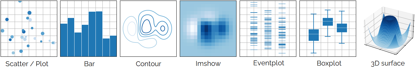
Fig. 7 Examples from the Matplotlib website.
For more information about this library: https://matplotlib.org/
To use this library, you need to import it in your script:
import matplotlib.pyplot as plt
Basic example
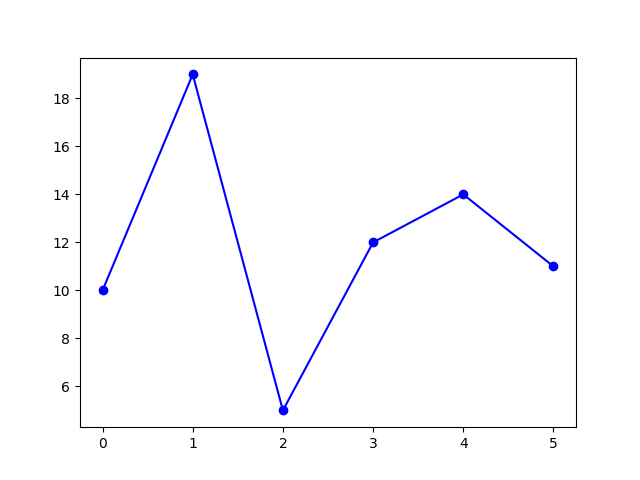
Here’s a simple example of how to use Matplotlib to create a basic line plot:
# Sample data
x = [0,1,2,3,4,5]
y = [10,19,5,12,14,11]

# Create a plot
plt.plot(x, y, marker='o', linestyle='-', color='b')

# Display the plot
plt.show()
This example displays this figure:
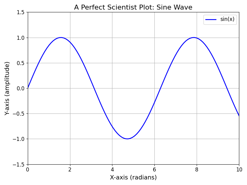
Scientist figure
Displaying a “perfect” scientist figure involves creating a clean, well-formatted plot with clear labels, titles, and appropriate styling.
Note
The code of this example is in the \progs\matplotlib\scientist_figure.py file of the repository.
import numpy as np
import matplotlib.pyplot as plt

# Example ndarray data
x = np.linspace(0, 10, 100)  # x values from 0 to 10
y = np.sin(x)  # y values as the sine of x

# Create the figure and axis
fig, ax = plt.subplots(figsize=(8, 6), dpi=100)  # Adjust size and resolution

# Plot the data
ax.plot(x, y, label='sin(x)', color='blue', linewidth=2, marker='+')

# Add title and labels
ax.set_title('A Perfect Scientist Plot: Sine Wave', fontsize=16)
ax.set_xlabel('X-axis (radians)', fontsize=14)
ax.set_ylabel('Y-axis (amplitude)', fontsize=14)

# Add grid and legend
ax.grid(True)
ax.legend(fontsize=12)

# Customize ticks
ax.tick_params(axis='both', which='major', labelsize=12)

# Set limits (optional, to ensure proper scaling)
ax.set_xlim([0, 10])
ax.set_ylim([-1.5, 1.5])

# Display the plot
plt.tight_layout()  # Adjust layout to avoid overlap
plt.show()
Result
This approach will give you a clean, professional-quality plot that adheres to scientific standards, making it suitable for publication or presentation. Adjust the parameters as needed to fit your specific requirements.
This example displays this figure:
About the code
Data to display
First, ensure that your data is organized into two vectors of equal length. In this example, the y vector represents the data to be displayed on the Y-axis, while the x vector provides the corresponding values for the X-axis.
Set Up the Plot
fig, ax = plt.subplots(...) creates a figure (fig) and a set of subplots (ax). figsize adjusts the plot size, and dpi adjusts the resolution. This two parameters are optional.
Plot the Data
ax.plot(...) plots x against y. You can customize the line with label, color, linewidth and marker options.
The label options correspond to the legend of the plot.
Enhance the Plot
ax.set_title, ax.set_xlabel, and ax.set_ylabel add a title and axis labels with appropriate font sizes.
ax.grid(True) adds a grid for better readability.
ax.legend(...) adds a legend to the plot.
ax.tick_params(...) adjusts tick marks and labels for clarity.
ax.set_xlim and ax.set_ylim set the limits for the x and y axes, ensuring proper scaling.
Latex commands are recongized by Matplotlib. You can insert mathematical expression with $ … $. For example : $z = sqrt{x^2 + y^2}$ will give: \(z = \sqrt{x^2 + y^2}\).
Display the Plot
plt.tight_layout() optimizes the layout to avoid overlapping labels.
plt.show() displays the plot.
Adding curve to a plot
It’s possible to add other curves on the same graph with the ax.plot(...) function.
ax.plot(x, y, label='sin(x)')
As in the last section, ax.plot(...) plots x against y. You can customize the line with label, color, linewidth and marker options.
The label options correspond to the legend of the plot.
Figure with subplots
In Matplotlib, the subplot() function is used to create multiple subplots within a single figure, allowing for the organization and comparison of multiple plots in one window.
Note
The code of this example is in the \progs\matplotlib\multi_figs.py file of the repository.
Create a grid of subplots
You can create a figure and a grid of subplots by using the plt.subplots() method. This function returns a figure object and an array of axes objects.
fig, ax = plt.subplots(nrows=2, ncols=2) # 2x2 grid of subplots
nrowsandncolsdefine the number of rows and columns of subplots.figis theFigureobject.axis a 2D numpy array ofAxesobjects (one for each subplot).
Add Data in a Subplot
You can now use each Axes object in ax to plot data. For example:
# Data for plotting
x = np.linspace(0, 10, 100)
y1 = np.sin(x)
y2 = np.cos(x)
y3 = np.sin(2 * x)
y4 = np.cos(2 * x)

# Plot data in each subplot
# First subplot (top-left)
ax[0, 0].plot(x, y1, 'r-')
ax[0, 0].set_title('Sine Wave')

# Second subplot (top-right)
ax[0, 1].plot(x, y2, 'b--')
ax[0, 1].set_title('Cosine Wave')

# Third subplot (bottom-left)
ax[1, 0].bar(x[::10], y3[::10])
ax[1, 0].set_title('Bar Plot')

# Fourth subplot (bottom-right)
ax[1, 1].hist(y4, bins=20)
ax[1, 1].set_title('Histogram')
Display the Plot
plt.tight_layout() optimizes the layout to avoid overlapping labels.
plt.show() displays the plot.
plt.tight_layout()
plt.show()
This example displays this figure:
Types of graphs
In Matplotlib’s pyplot, there are several types of graphs that you can create, each suited for different kinds of data visualization.
Note
The codes of the next examples are in the \progs\matplotlib\plot_types.py file of the repository.
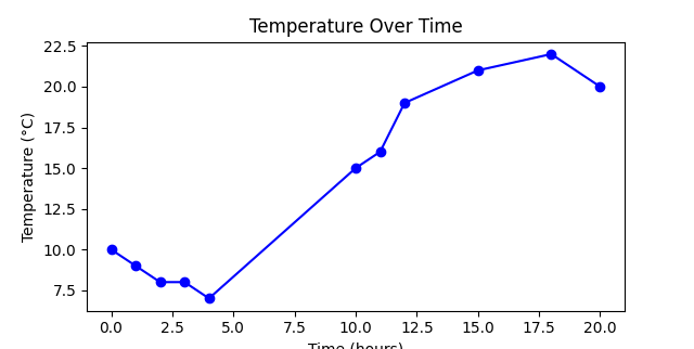
Line Plot (plt.plot)
This is the most basic and commonly used plot. It connects data points with a continuous line and is used to visualize trends over time or other continuous variables.
# Example data
time = [0, 1, 2, 3, 4, 10, 11, 12, 15, 18, 20]  # Time in hours
temperature = [10, 9, 8, 8, 7, 15, 16, 19, 21, 22, 20]  # Temperature in degrees Celsius

# Create the plot
plt.plot(time, temperature, marker='o', linestyle='-', color='b')

# Add labels and title
plt.xlabel('Time (hours)')
plt.ylabel('Temperature (°C)')
plt.title('Temperature Over Time')

# Display the plot
plt.show()
This example displays this figure:
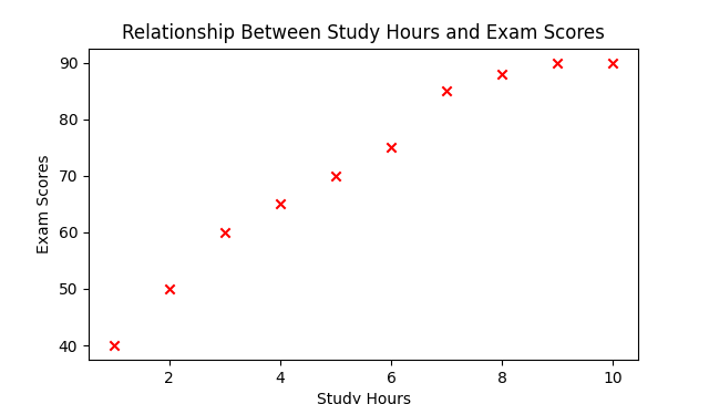
Scatter Plot (plt.scatter)
It displays individual data points as markers. Scatter plots are useful for showing the relationship between two variables.
# Example data
study_hours = [1, 2, 3, 4, 5, 6, 7, 8, 9, 10]  # Hours spent studying
exam_scores = [40, 50, 60, 65, 70, 75, 85, 88, 90, 90]  # Exam scores

# Create the scatter plot
plt.scatter(study_hours, exam_scores, color='r', marker='x')

# Add labels and title
plt.xlabel('Study Hours')
plt.ylabel('Exam Scores')
plt.title('Relationship Between Study Hours and Exam Scores')

# Display the plot
plt.show()
This example displays this figure:
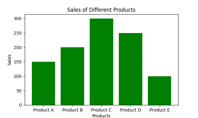
Bar Plot (plt.bar and plt.barh)
Vertical bar plots (plt.bar) represent data with rectangular bars, where the length of each bar is proportional to the value it represents. Horizontal bar plots (plt.barh) are the horizontal counterpart.
# Example data
products = ['Product A', 'Product B', 'Product C', 'Product D', 'Product E']  # Product names
sales = [150, 200, 300, 250, 100]  # Sales numbers

# Create the bar plot
plt.bar(products, sales, color='green')

# Add labels and title
plt.xlabel('Products')
plt.ylabel('Sales')
plt.title('Sales of Different Products')
This example displays this figure:
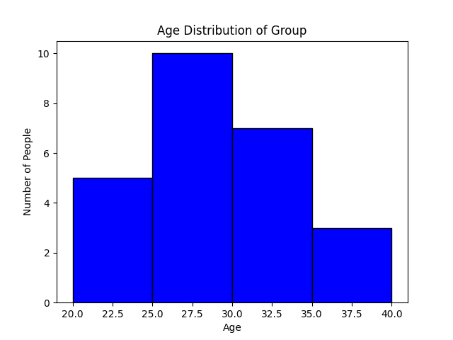
Histogram (plt.hist)
A histogram displays the distribution of a dataset by dividing the data into bins and showing the number of data points that fall into each bin.
Let’s say you have data representing the ages of a group of people, and you want to visualize the distribution of these ages using a histogram.
# Example data
ages = [22, 25, 29, 24, 23, 28, 30, 22, 24, 26, 32, 35, 31, 29, 28, 34, 36, 37, 28, 29, 30, 31, 33, 27, 26]

# Specify custom bin edges
bins = [20, 25, 30, 35, 40]

# Specify the range to display
range_to_display = (20, 40)

# Create the histogram
plt.hist(ages, bins=bins, range=range_to_display, color='blue', edgecolor='black')

# Add labels and title
plt.xlabel('Age')
plt.ylabel('Number of People')
plt.title('Age Distribution of Group')
The plt.hist() function creates a histogram. The bins=5 argument divides the data into 5 bins (ranges of age). The color option sets the color of the bars, and the option edgecolor adds a border around the bars for clarity.
The parameter bins permits to specify the edges of the bins. Here a list is provided a list. This creates four bins: 20-25, 25-30, 30-35, and 35-40.
The parameter range sets the display range, here from 20 to 40. This ensures that only the data within this range is considered and displayed on the histogram.
This example displays this figure:
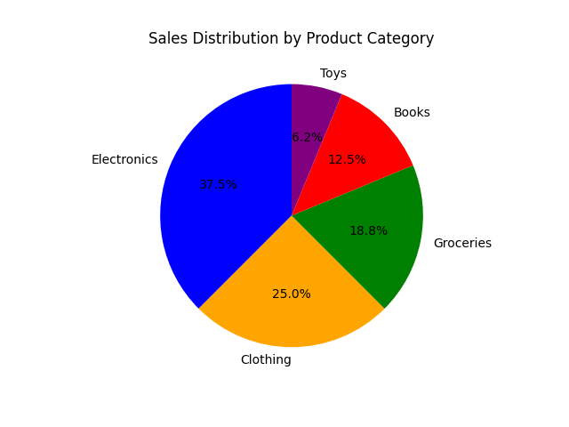
Pie Chart (plt.pie)
A circular chart divided into wedges, each representing a proportion of the whole. Useful for showing parts of a whole but less effective with many categories.
Let’s say you want to visualize the distribution of sales across different product categories in a store.
# Example data
categories = ['Electronics', 'Clothing', 'Groceries', 'Books', 'Toys']
sales = [300, 200, 150, 100, 50]

# Create the pie chart
plt.pie(sales, labels=categories, autopct='%1.1f%%', startangle=90, colors=['blue', 'orange', 'green', 'red', 'purple'])

# Add a title
plt.title('Sales Distribution by Product Category')
The labels argument takes a list to label each wedge of the pie chart.
The autopct argument adds the percentage of each wedge on the pie chart. This option is formatted.
The startangle argument rotates the start of the pie chart. Here to 90 degrees, making the first wedge start at the top.
This example displays this figure:
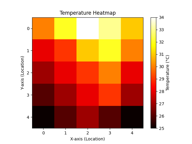
Heatmap (plt.imshow)
You can use imshow() method to create a heatmap. Heatmaps display data in a matrix form with colors representing different values.
Note
The imshow() method is initially designed to display images (2D-array).
Let’s say you have data representing the temperatures recorded at different locations in a 5x5 grid, and you want to visualize this data as a heatmap.
# Example data: 5x5 grid of temperatures
temperature_data = np.array([
        [30, 32, 34, 33, 31],
        [28, 29, 31, 32, 30],
        [27, 28, 29, 30, 28],
        [26, 27, 28, 29, 27],
        [25, 26, 27, 26, 25]
])

# Create the heatmap using plt.imshow
plt.imshow(temperature_data, cmap='hot', interpolation='nearest')

# Add a color bar to indicate the temperature scale
plt.colorbar(label='Temperature (°C)')

# Add title and labels (optional)
plt.title('Temperature Heatmap')
plt.xlabel('X-axis (Location)')
plt.ylabel('Y-axis (Location)')
In this cas, data is a 2D NumPy array, in this example representing temperature values at different grid locations.
The plt.imshow() method creates the heatmap. The cmap argument specifies the colormap, with ‘hot’ being a common choice for temperature data. interpolation ensures that each grid cell is displayed as a solid color block without any smoothing.
The plt.colorbar() method adds a color bar next to the heatmap to indicate the temperature scale.
This example displays this figure:
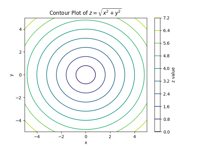
Contour Plot (plt.contour and plt.contourf)
Contour plots are useful for visualizing 3D data in two dimensions by showing the level curves of a function.
Let’s create a contour plot of a mathematical function, such as \(z = \sin(x^2 + y^2)\).
# Define the grid of x and y values
x = np.linspace(-5, 5, 100)
y = np.linspace(-5, 5, 100)
X, Y = np.meshgrid(x, y)

# Define the function z = sin(x^2 + y^2)
Z = np.sin(X**2 + Y**2)

# Create the contour plot
contour = plt.contour(X, Y, Z, levels=10, cmap='viridis')

# Add a color bar to indicate the z value scale
plt.colorbar(contour, label='z value')

# Add title and labels
plt.title('Contour Plot of $z = \sin(x^2 + y^2)$')
plt.xlabel('x')
plt.ylabel('y')
The np.meshgrid(x, y) creates a 2D grid of x and y values (see the next chapter of this training).
The Z = np.sin(X**2 + Y**2) instruction defines the z values as the root square of the sum of squares of x and y. It creates a 2D array of z values corresponding to each (x, y) pair.
The plt.contour() method creates the contour plot.
The levels argument specifies the number of contour lines, and the cmap argument sets the colormap used to represent the values.
The plt.colorbar() adds a color bar to the plot to indicate the range of z values.
This example displays this figure:
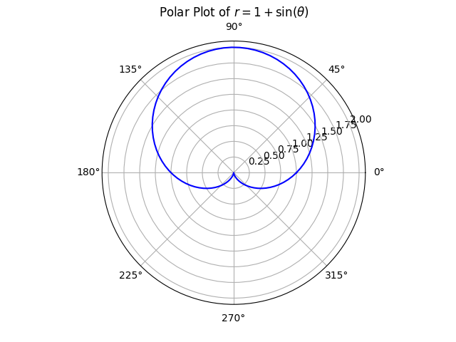
Polar Plot (plt.polar)
Polar plots are useful for visualizing data that is inherently circular, such as angular data.
Let’s create a polar plot of a simple function, such as \(r = 1 + \sin(\theta)\), where \(r\) is the radial distance and \(\theta\) is the angle in radians.
# Define the angular data (theta) and radial data (r)
theta = np.linspace(0, 2 * np.pi, 100)  # 100 points from 0 to 2*pi
r = 1 + np.sin(theta)  # Radial distance as a function of theta

# Create the polar plot
plt.polar(theta, r, color='b')

# Add a title
plt.title('Polar Plot of $r = 1 + \sin(\\theta)$')
This example displays this figure:
3D figures
http://lense.institutoptique.fr/mine/python-matplotlib-graphiques-3d/